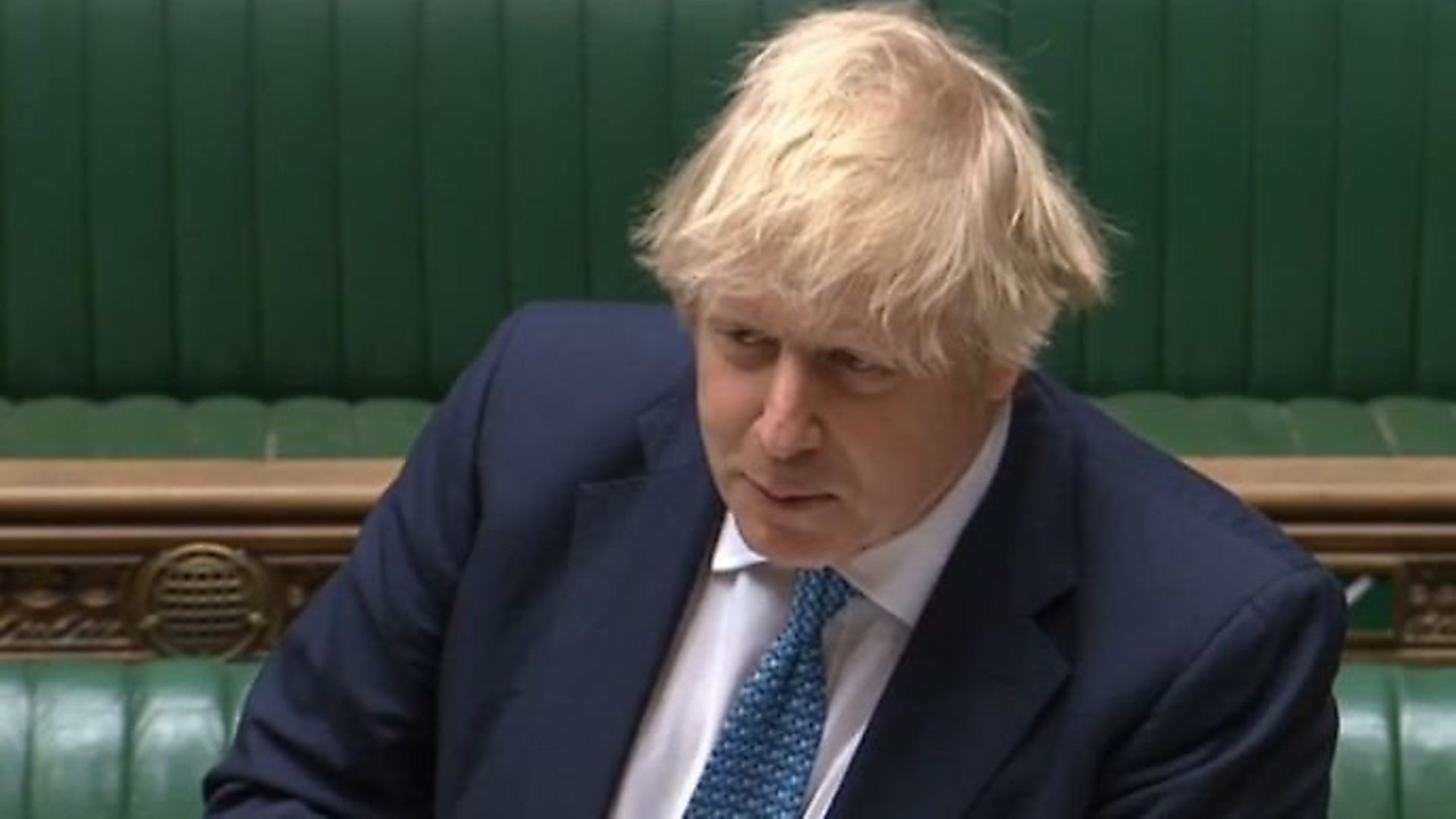
Boris Johnson has been challenged at Prime Minister’s Questions to explain why the government removed international comparison charts from daily coronavirus briefings.
Labour leader Sir Keir Starmer pushed Johnson to explain why international coronavirus death charts had been removed from daily Downing Street briefings.
‘For many weeks the government had compared the UK number against many countries. Last week I showed the prime minister his own slide showing the UK now has the highest death toll in Europe and the second hihgest in the world,’ Sir Keir said.
Holding up a print out of the slide, he continued: ‘A version of this slide has been shown at No 10 press conferences every day since the March 30 – that’s seven weeks. Yesterday, the government stopped publishing international comparisons and the slide has now gone. Why?’
Johnson replied that it was ‘premature’ to draw comparisons with other nations, arguing none could be made until the global excess death tolls had been counted. He then told the leader of the opposition to ‘contain his patience’ on the matter.
‘Mr Speaker, I’m not going to pretend to the House that the figures, when they’re finally confirmed, are going to be anything other than stark and deeply, deeply horrifying. This has been an appauling epidemic.’
Sir Keir replied: ‘I’m baffled. It’s not me who is trying to draw comparisons. These are the government’s slides that have been used for seven weeks, to reassure the public.
‘The problem with the prime minister’s answer is that for seven weeks when we weren’t the highest number in Europe, they were used for comparison purposes. As soon as we hit that unenviable place, they’ve been dropped.’
Sir Keir quoted statistician David Spiegelhalter, who has been helping with the government’s coronavirus efforts, saying the professor felt drawing comparisons could ‘help’ Britain learn more about the disease.
Warning: Illegal string offset 'link_id' in /mnt/storage/stage/www/wp-includes/bookmark.php on line 357
Notice: Trying to get property 'link_id' of non-object in /mnt/storage/stage/www/wp-includes/bookmark.php on line 37


